#LOGO

The SEGIBIZ CI is a wordmark in English titled “Visible Driving Force.” The SEGIBIZ design emphasizes solid straight lines and balanced arrangements.
It represents trust-based technology and systematic industrial solutions, and symbolizes the drive toward the global market.

시그니처
#COLOR

The CI symbol color is based on SEGIBIZ ORANGE, the corporate color of Segibiz.
When designing a package, you can use a CI with white color applied according to the background color.
Additionally, for black and white media, black can be used, and for special visual effects, gold and silver can be used.

  • SEGIBIZ ORANGE
    R:235 / G:94 / B:1
    C:5 / M:76 / Y:98 / K:0
    #f05e01
    PANTONE 166C
  • SEGIBIZ BLACK
    R:0 / G:0 / B:0
    C:93 / M:88 / Y:89 / K:80
    #000000
    PANTONE BLACK C
  • SEGIBIZ SLIVER
    R:164 / G:164 / B:165
    C:1 / M:1 / Y:0 / K:35
    #a4a4a5
    PANTONE 422C
  • SEGIBIZ RED
    R:219 / G:57 / B:40
    C:17 / M:90 / Y:89 / K:0
    #db3928
    PANTONE 7579C
#GRID

When using CI, make sure to leave some space around it.
This is to maintain SEGIBIZ’s unique identity by adhering to the composition criteria and ensuring independence from other elements.

시그니처
#CHARATER
로핀
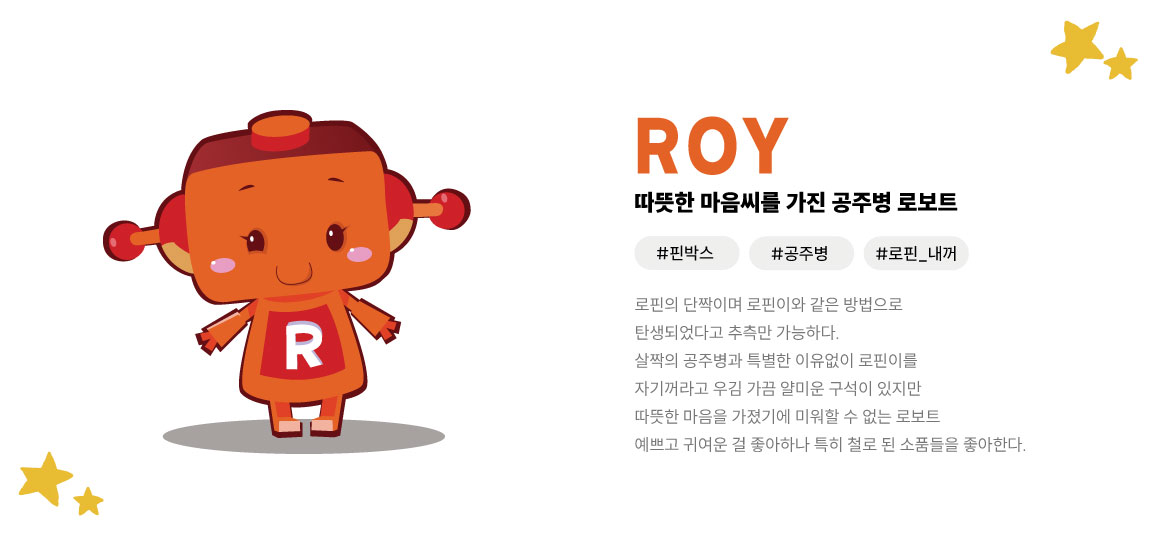
로이
멍박스
회사소개
펼쳐보기

회사소개

제품소개

UL 제품소개

자료실

문의하기

고객센터

쇼핑몰